For projects in which colour consistency or vibrancy is paramount, spot colours are the best choice.
Available in a host of shades, including metallics, pastels and neons, spots produce colours that are difficult or impossible to reproduce from four colour process. As such, spots are a great way to improve the quality of your prints.
What are spot colours?
At their simplest, spots are coloured inks that come premixed straight out of a tin, a bit like paint.
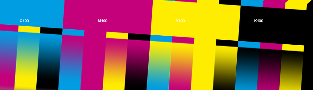
In litho (offset) printing, each spot colour has its own plate. Any number of spot colours can be printed on their own, but two spot colours are the most common. Spot colours can also be printed in addition to the usual four colour process (CMYK + spots).
Some digital presses also print spot colours. Ask your supplier if they offer this service.
A number of transparent spot finishes such as matte or gloss varnishes are also available.
Why bother?
• Accuracy
The main advantages of spot colours are vivacity (they can be very strong) and veracity (a spot colour will always appear the same).
Some colours can look plain muddy in CMYK. As we have already discussed in a previous post, strong oranges and greens are notoriously difficult to reproduce from four colours, as are pastels. For example, Pantone 375 is a lovely apple green spot colour. A printer would have trouble matching the vibrancy of that colour from CMYK.
Even if you have taken the time to painstakingly build a colour shade from CMYK, the wrong prepress settings applied by your print supplier can undo all your good work. A spot colour takes that variable out of the equation.
Many large companies will insist that their logo is reproduced from spot colours. This ensures that colours remain consistent from publication to publication and across different media.
• Quality
Printing in CMYK, tiny variations in registration (how the plates are lined up during printing) between multiple plates can introduce a degree of fuzziness. This is especially apparent with coloured type in a light weight. In contrast, the single hit of a spot colour will always produce a clean, sharp print.
For this reason, the most common use of spot colours is stationery. A business card or compliment slip is comprised of so few elements, the quality of reproduction becomes even more important. (Yet another reason why you should never buy a million bizcards online for a fiver, unless you plan to carpet bomb the town with them.)
• Finishes
Spot colours also give you the option of transparent spot UV (gloss) or matte varnishes. These are applied as you would another spot colour with their own plate.
Spot varnishes create an interesting contrast of finishes when used together or in combination with a gloss or matte laminate. Another option is to contrast varnish with paper, say for example a spot UV printed on an uncoated or matte stock.
• Cost
Surprisingly, printing in two spot colours can often be less expensive than CMYK, as there are fewer plates to set up and print (two versus four for CMYK).
• For the sheer hell of it
Spot colours are fun! Designing in two colours can yield more interesting results than in four. The right combination of spot colours and effects will also create prints that pop. Why not have a go?
Pantones
The only spot colours you will likely encounter in Europe or America is the Pantone system. As with process colours, the company produces a set of reference guide books. Each individual spot colour assigned a name or number; for example, Pantone 375 is a nice apple green, whereas Pantone Rhodamine Red is a deep pink.
Each Pantone colour number has one of three suffixes: C for “Coated”, M for “Matt” and U for “Uncoated”. Each corresponds to the intended paper stock. Specify C for gloss, M for matt or silk, and U for uncoated or bonds.
There can be a surprising degree of variation between the same number with a different suffix. A printer can re-specify an unmatched colour choice at the prepress stage, but as with anything else, it is best to get this right yourself from the outset.
Where there’s blame, there’s a claim
Checking against the Pantone spot colour book gives you a fall back should your prints not turn out as anticipated. If there is a large variation between the colour book and final print, have a word with your printer about a discount or having it printed again at their cost. You will no doubt encounter bluster about “variations in paper stock” and so forth, but if you have taken the time to match a Pantone to the right stock, your printer is unlikely to have a leg to stand on.
Using spot colours
We will cover how to use spot colours in the next post. As per usual, we will also discuss common spot colour prepress problems and how to cure them.


